Picking paint colors for the inside of your home can feel like a really daunting task, but it doesn’t have to be. We have a number of palette-picking tips from two of the top paint companies in the businesses, and now you can use them to take your home to the next level.
YOU DON’T NEED “UNIQUE” COLORS EVERYWHERE, BUT DEFINITELY DO IT IN TRAFFICKED AREAS!
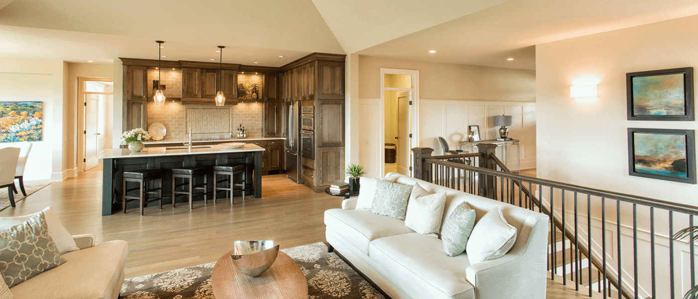
Not every wall in your home needs to be a bold color, but areas like the living room get a lot of quality time, so helping define that space with paint can completely change the feel of the room.
“The main living area of your house is where you establish your signature style … No matter what your look, the perfect paint color will underscore it.” – Benjamin Moore & Co.
Use your biggest furnishing in the room as a starting point!
If you’re trying to pick paint for an already furnished room, look for the thing that has the largest pattern, and pull colors from there.
“Think of a favorite rug or fabric you own. Often these objects are your favorites because they feature all the colors you like” – The Sherwin-Williams Company
Choose the right color scheme for you and for each space!
You can rock a single color with a neutral color like white or grey just as easily as a designer set of colors, you just need to decide which feel you prefer. At the end of the day, paint reflects your personality and feelings about the room, so make use of that.
“Color has the power to change not only the look of a room, but also the ambiance. Do you need a boost to wake up or a cocoon to encourage relaxation?” – Benjamin Moore & Co.
Remember that color wheel from elementary school? Use it!
Once you have a dominant color for a room, the best way to choose the next color to feature is to look at the color wheel and choose a color right next to it or directly across from it. For example, blue and green pair well, but so do orange and blue.
“An understanding of the basics of color theory and the color wheel can help you achieve your design goals and increase the possibilities of your work.” – The Sherwin-Williams Company
Work your paint colors in a 60-30-10 pattern!
Three colors is the most you really want to emphasize in a room, or the room starts to feel very disjointed. Make your primary color 60%, your accent color 30%, and your accessory color 10%.
“Consider reserving bold colors for room décor or furniture, allowing a practical neutral or pale hue on walls to stay tried and true, year after year.” – Benjamin Moore & Co.
When in doubt, default to grey walls!
White paint, as well as “eggshell,” are the standard colors for decades, but designers are starting to use variations of grey instead.
“Gray walls exude a modern simplicity with a fresh yet familiar feel. They integrate well with natural views and are great complements to a range of furnishings.” – Sherwin-Williams Company
BONUS: Don’t be afraid of black!
Black makes everything stand out or hide, which can be useful as a paint color or as an accent to your furnishings. Just make sure you don’t overdo it!
A white sofa and light, sheer window treatments pop against the black, and draw the eye from its depths.
“Enigmatic and understated, black can showcase other colors to their fullest.” – Benjamin Moore & Co.